Babyhouse
An editorial storefront for a childrenswear label.
A boutique shop rebuilt around a single typographic system, so a catalogue of several dozen products reads as one considered range instead of a feed.
Product pages, collection pages and the whole navigation model were redrawn together.
- What was made
- Art direction
- Storefront design
- Front-end build
- Built with
- Shopify
- Liquid
Website design in Christchurchfrom $1,500, fixed before it starts
What it does
One typographic system across the whole catalogue
A boutique with several dozen products can easily read as a feed. Every page — home, collection, product — is set from the same small type scale and the same two rules, so the range looks like one considered set rather than whatever arrived this month.

Shopping the way a parent actually shops
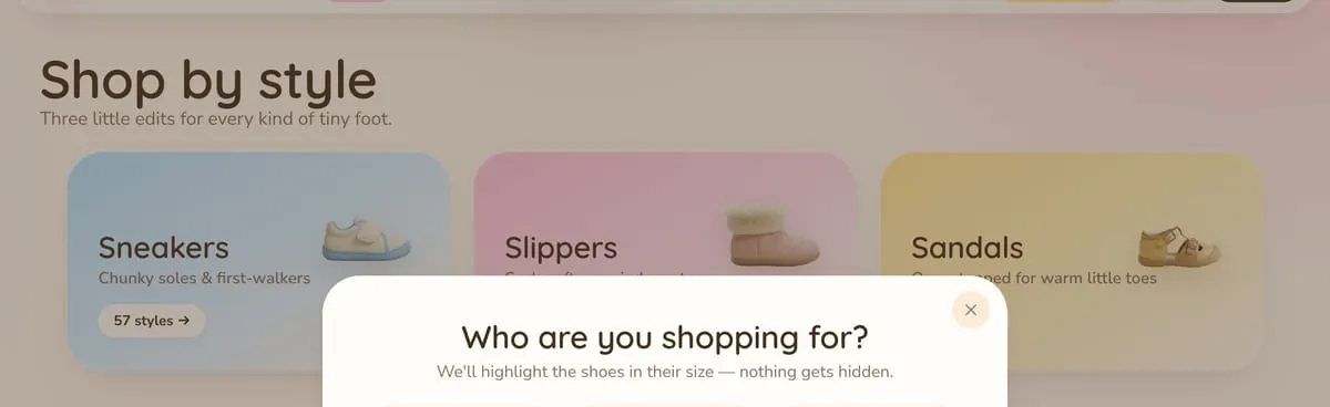
Shop by style for someone who knows what they want, and an age-led route — "how old are they?" — for someone buying a gift. Two doors into the same catalogue, because those are two different customers.
Product cards that answer before the click
Name, price, sizes and rating on the card itself, so a customer can rule a shoe out without loading a page. On a phone that is the difference between browsing and giving up.

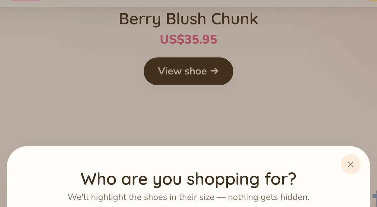
The size question asked once, up front
A shopper is asked who they are buying for before they browse, and the range is then marked in that size — nothing is hidden, nothing is filtered away. It is the one question that decides whether a childrenswear order fits, so it is asked first rather than at the checkout.